.png)
Smiley Faces and Service Design: Going Beyond HappyOrNot
Here’s a blog post draft titled “Smiley Faces and Service Design: Going Beyond HappyOrNot”. It explores how tools like HappyOrNot terminals can be useful in service design but also how they fall short unless paired with deeper analysis.
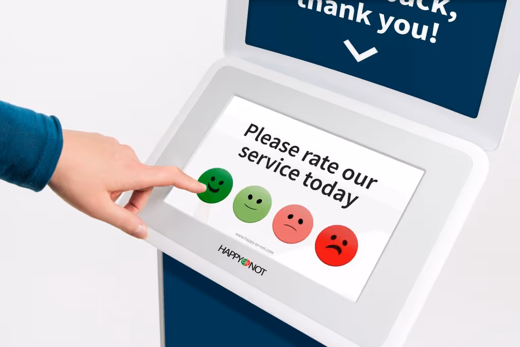

Walk into an airport bathroom, a hospital reception, or a council service desk and you might spot it: a simple stand with four colourful buttons, asking how your experience was. Ranging from a sad red face to a vibrant green grin, HappyOrNot terminals have become a familiar sight across the service landscape.
At first glance, these tools seem like a win. They’re simple. Frictionless. Real-time. But from a service design perspective, what do these smiling (or frowning) faces actually tell us? I always use them when I see them. But I often wondered what would I do with this data if I was working on the service...
And more importantly: how can we use them to improve services—not just monitor them?
The Appeal of HappyOrNot
HappyOrNot terminals are popular for good reason:
- They give instant feedback at scale.
- They’re unobtrusive and intuitive.
- They’re relatively low-cost to implement.
- They offer simple performance dashboards for managers.
For many organisations, these devices are the only real-time feedback they collect—especially in environments like public sector offices, where survey fatigue and digital barriers are real.
But Here’s the Catch
While they’re great for gauging momentary sentiment, HappyOrNot feedback lacks depth. It doesn’t tell you:
- Why a customer was unhappy.
- Whether the issue was caused by a person, process, policy, or place.
- If the feedback was influenced by factors unrelated to the service (e.g. personal stress, weather, queues elsewhere).
And crucially, it doesn’t show you what part of the service journey failed.
From a service design lens, this is a problem. Service performance is not a single moment—it’s a sequence. And improvement relies on seeing the entire system.
A Better Approach: Triangulate the Smiley
To turn these terminals into something truly meaningful, service designers need to integrate them into a broader ecosystem of data and insight.
Here’s how to do it:
1. Map Moments to Journeys
Position HappyOrNot terminals at key moments of the customer journey—and make those moments explicit in your service blueprint. Are you capturing sentiment after a queue? After a decision? After a payment? The context matters.
2. Overlay Operational Metrics
Match sentiment data with operational metrics at that moment:
- Wait times
- Staff levels
- Ticket resolution rates
- This helps move from “people are unhappy” to “people are unhappy when there are 2+ people ahead of them and only one staff member available.”
3. Introduce Qualitative Layers
Combine the button data with ethnographic research, interviews, or even QR codes leading to short surveys. Capture stories, not just clicks. Understand why the face was pressed.
4. Close the Loop
If you’re not using the data to redesign touchpoints, change staffing patterns, or adjust policies, it’s just passive monitoring. Service design is about iteration. Share insights. Test improvements. Measure again.
5. Visualise the Impact
In your service blueprint or performance dashboard, show correlations between customer sentiment and outcomes:
- Are unhappy customers less likely to complete a process?
- Do positive spikes align with specific interventions?
- Did a service prototype improve the green-button rate?
This closes the loop between experience and performance.
The Takeaway
HappyOrNot is a useful input—but not an outcome. It’s a temperature check, not a diagnosis. In isolation, it risks being performative—something to show the board or stick in a report. But when integrated thoughtfully into a service design toolkit, it becomes a valuable signal.
The real power comes when we move beyond the button. When we trace the smiley back to the system. When we use that feedback to design something better.
Because ultimately, a green smiley is good—but a better service is even better.